
There has been abundant discussion among designers and creative people around the world in this recent period about the transition from elaborate and complex graphics (scheumorphism), to the minimalist style of Flat Design, or “flat design.”
Within a few months, this new style is literally conquering the web and beyond. We will elaborate on this issue below by bringing you some examples and analyzing the reasons behind this change.
What exactly is scheumorphism?
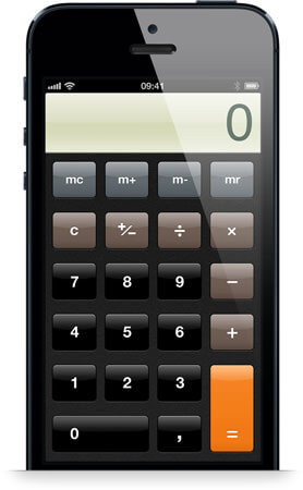
The term scheumorphism refers to a type of purely aesthetic style that seeks to imitate, in a digitally illlusory way, the real world. All of this can be rendered visually through the use of complex textures and graphic devices that tend to greatly increase the level of detail. The problem arises when this realistic representation takes on excessive and baroque forms that end up reducing its usefulness and disrupting user navigation and usability.
The main features of this style are:
- Artifact graphic elements with no functionality other than purely visual;
- voluminous format;
- three-dimensional rules, shading, gradients, 3D buttons, and rounded frames.
Flat design as a new way of life
The new graphics result in maximum user understanding and readability through a design that focuses particularly on communicability and visual clarity, rather than graphic elements. Thus, the multiple decorations that had characterized the graphics until now disappear, preferring the path of minimalism and simplicity.
The move to flat design was dictated not only by an aesthetic criterion but primarily by the need to help the user become familiar with the multitude of devices on the market and the increase in their functionality.
In an increasingly complex and competitive technological scenario, the decision is made to facilitate the user so that they can move smoothly and not get lost in the complexity of unintuitive graphical interfaces. Just to address this recent issue, even giants such as Microsoft and Apple, have decided to completely revolutionize their UIs. The trend of the shift to flat style is evident in the new Windows 8 interface through a “tiled” layout, with stark colors and linear fonts that provide an easy navigation experience designed with a Crossplatform perspective; thus conveniently usable from mobile devices.
The response is immediate from Apple with the launch of iOS7, the new operating system developed by Jonathan Ive. In this new interface there is a clear sense of the decision to abandon the path of a multitude of graphic ornaments in favor of a two-dimensional, clear and direct design that does not disappoint the end user but helps him in his daily task.
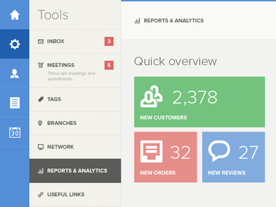
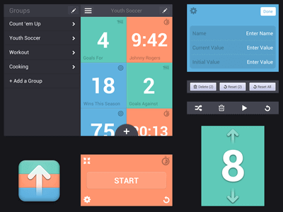
The key points that characterize Flat Design are:
- Clean layout dictated by simplicity of elements;
- Linear design fonts, possibly used in their bold declination;
- Prevalent use of geometric shapes;
- buttons and stylized icons;
- Bright colors and little artifact.
That’s not all. Now that you have an overview of this important style transition, we think it is useful to give you some tips so that you can better plan your new interface.
As we have seen, flat graphics don’t need a lot of tweaking; but that is precisely why we need to pay attention to the few rules that the style requires of us. We cannot underestimate the simplicity of the elements, and we must have utmost care in lettering, preferring the use of essential design fonts that allow for greater visual consistency and more readability. In addition, it is especially important to take great care in selecting the right colors; remembering that when we choose the palette to be used, it must be designed to help users by being careful not to risk weighing down the graphics without being able to make the points of interaction focus.
An excellent online tool for designing your color palette is made available by the leading graphics brand Adobe and will allow you a precise construction of what in the jargon can be called a true attractive interface. We refer you directly to the link without taking away your enjoyment of the fantastic workings of this excellent tool: https://color.adobe.com/it/create/color-wheel
Otherwise, if you are not patient and savvy enough to build your own color chart from scratch, you can rely on this other simple online tool that will allow you to generate it directly from an image you like. A good place to start when you have no idea what graphic style to use or want to structure the interface in line with your logo. http://www.cssdrive.com/imagepalette/
Otherwise, we suggest some good graphics for you to take inspiration from, although in general the search for your favorite style can be inspired continuously and not only by the web:
Ultimately, it matters little whether flat design is only a temporary trend or that scheumorphism has gone out of fashion, the important thing is that the two graphic variants testify to different needs and mark the fundamental shift of functionality over aesthetics. We found ourselves to be spectators to a new way of thinking about web design, and we gave ourselves the opportunity to create an interface that was both credible and usable, dictated, if you will, by creative functionality!