
A common mistake regarding design and the role of the designer is to think that the work consists only of artistic choices, a mere creative and aesthetic expression, losing sight of the complexity of knowledge required to create an effective and easily usable product. In the ‘baggage’ of a designer, in fact, there must be many elements that are not purely artistic, and one of them is definitely psychology.
How can this science come to the aid of us designers?
Let’s find out through 5 basic concepts: the Gestalt, Hick’s law, the von Restorff effect, color psychology, and Maslow’s hierarchy.
What does Gestalt have to do with an effective UI?
Gestalt is a psychological current that is based on perception and experience, particularly the relationship between different elements.
Some fundamental design concepts are:
Similarity: when a user sees two similar items automatically the brain lumps them together as part of the same group or with the same level of importance. Similarity can be in shape, color, size, etc., and in design this principle is used to create consistency and to help in determining the importance of elements.

Proximity: two elements close to each other are perceived by the brain as being part of the same whole, although visually different.

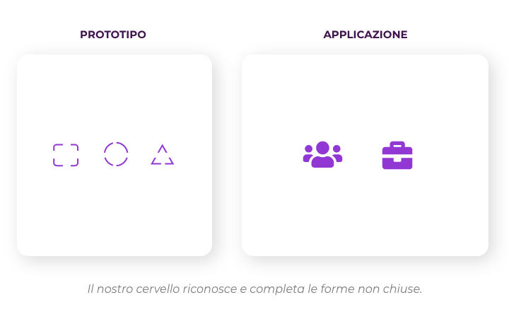
Closure: indicates the brain’s ability to complete a shape even if it is not completely closed. Often this principle is used to create logos or icons so as to simplify the form and let the brain do the rest.
Continuity: elements are perceived as a unit based on the direction they follow. This principle is often exploited in the creation of carousels.

The slogan “The whole is more than the sum of the parts” encapsulates these (and other) principles. Taken individually, in fact, the elements would be meaningless… However, when grouped together they manage to take on meaning and value, thus effectively conveying the designer’s message.
[Recommended book: “Science of Vision. Space and Gestalt, Design and Communication.”]
The user interface and Hick’s law
This famous law states that “the time in which a person makes a decision is proportional to the amount and complexity of existing alternatives.” The usability of a product, therefore, improves exponentially as the designer minimizes the elements and actions that can be performed, so as to convey and simplify user choices. Conversely, a large amount of graphical elements slows down the speed of action and can confuse and frustrate the user, prompting them to abandon the platform in the worst case.
[Recommended book: “Simple and Usable Design. Web, mobile devices, and interactions.”]
The von Restorff effect
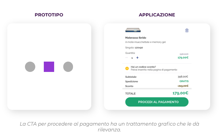
Also known as the “isolation effect,” this principle predicts that when confronted with a group of similar items the one that stands out most from the others will take on greater importance in our perception and thus be remembered. A classic example is the CTA(Call To Action) – which always has a different color (and/or shape, and/or size) from the other elements, to make it more visible – or the prices in the offer that are highlighted in the same way to have more relevance.
[Recommended book: “The Principles of Form. Nature, Perception, Art.”]
User interface and color psychology
Fundamental to design is the use of colors not only as an aesthetic choice but more importantly as a functional and meaningful choice.
In design, color matching can occur based on many choices; in general, warm colors are stimulating and assertive (red, yellow, and orange are often used for error notifications or the like) while cool colors and pastel shades are reassuring and inspire confidence. Complementary colors have the greatest contrast and catch the eye, while monochromatic shades (light, medium and dark versions of the same color) provide a less sharp but more subtle and no less effective contrast.
Each color choice, then, must be curated according to the message you want to give while obviously taking into account the fact that the meaning of colors differs according to the target culture. A well-known American fast food chain, for example, replaced the background of its logo with green in countries where there was particular sensitivity to environmental issues.
[Recommended book: “Chromorama. How color has changed the way we look.”]
Maslow’s hierarchy of needs
A fundamental part of marketing and design choices is the principle of Maslow’s pyramid, a concept of the U.S. psychologist Abraham Maslow who conceived of a hierarchy of basic human needs to be met, starting with primary and physiological needs and ending with those related to self-actualization.
Design and marketing strategies take advantage of this principle and are designed to make a given product or service fit a specific need to be fulfilled and to stimulate users’ emotions through a study of essential needs.
An example? Taking into consideration two smartphone manufacturer brands, one cheaper and one more expensive and popular, we can say that both satisfy the need to be able to communicate but the second one in addition satisfies other needs related to social status and self-actualization.
[Recommended book: “Design Principles. Designing interactive products and systems on people’s needs.”]
To conclude: our brains autonomously follow rules to process reality, and a designer must take them into account when designing to improve usability, user experience, and to achieve their goals.