
Responsive is the keyword of cutting-edge webdesign. And we are not talking about a passing fad, but a key point in terms of effectiveness and navigability.
It is enough to pay attention to Google Analytics, under the Audience/Mobile heading to understand a fundamental concept: if our site is not responsive, all the slice of visitors beyond the “desktop” heading can be given up for lost.
But let’s not be despondent, simply reevaluate our website and do a responsive redesign.
Let’s take stock of the situation together.
Responsive Web Design is critical to not losing traffic:
- What is the target audience of web agencies?
Not all websites are penalized equally by a fixed layout. If we have a type of business that – for example – has impulse buying as its core business, then we can rest assured that a well-structured responsive layout makes all the difference. Imagine shopping on ebay from your smartphone using the classic desktop interface… You would buy very little! - Desktop first or mobile first?
Furniture first, of course! It’s like the writing of a book, first you throw down the outline and then you expand on it.
At
designing a website
“from scratch,” we must first think small. This not only helps us do intensive synthesis work that brings out only the most important information, but also allows us to improve the user experience by preventing the user from wasting time and bytes in displaying information that is of little use in the context of mobile browsing. And with that I introduce the next point. - What does the user do while visiting our website?
He is in the bathroom! Perhaps this observation will bring a smile to your face, but it gives an idea of the environmental contexts of mobile surfing. When browsing with your smartphone, are you sitting comfortably at your desk? We need to empathize with the situation the customer is in while visiting our website: standing during the bus ride, with the briefcase between his ankles, clinging with one hand so as not to fall and the phone in the other. Can we perhaps think that at such a time he is well disposed to be faced with an unnavigable site? - And so, how should I develop this responsive site?
First, we must carefully design the various breakpoints, i.e., the key dimensions that our site must have depending on the target device.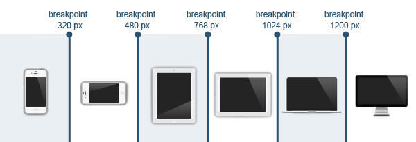
Within this range we need to include images and text suitable for the usable area.
For example, if for a 1024px desktop layout we can match an 800px image and a text of a few hundred words, the corresponding page for a device in portrait (portrait) mode will have to include an image of up to 320px (thus occupying the entire width of the screen) followed by text of a few lines.
In this case we can use a tweakpoint to resize and rearrange the elements according to the reference structure.
In making a responsive site, forget pixel statements, from now on we will think in percentages.
For example, if we want to distribute three images in 600px of space, we will not use three blocks of 200px each, but three blocks with width:33.33%.
Ditto for the font. If we abused 12px for our desktop site, now we have to speak in “em,” a unit of measurement that dynamically adapts to the device: we use the rule font-size:100% for our body and font-size: 1.5em for H1 and so on. - What about everything else?
There is Mastercard! But we don’t need to call in banks, for everything else there are components and plugins preemptively made by diligent programmers, with which you can expand your mobile site without penalizing the user experience.
Video: by uploading a video to YouTube, not only do we save ourselves the investment in a CDN (content delivery network), but we can benefit from plugins like fitvids.js that will do the dirty work for us.
Slideshows and fillable forms: all the best components (including free ones) for slideshows and form design, at present, guarantee excellent responsive performance on all devices.
Font-Family: our visitors arrive with completely different technologies, because an iPhone doesn’t have the same font pack installed as an Android, and both still have different fonts than Windows. To be on the safe side, just rely on the capable hands of BigG. Google Fonts are accessible for free and implementation is super easy:
Choose the font from: http://www.google.com/fonts
Click on “quick use”
Incorporate the rule into your site:
Use the font in your CSS: font-family: ‘nameFont’; - Now that I have the tools, how do I use them to get the best out of them?
 With all these tools, make sure that your mobile version site is a good landing page that brings a high conversion rate.
Use a nice image and an original call to action, you know the classic irresistible button, which from touch is even more effective? There, just that. And remember to put it above the fold, because scrolls are detrimental from a conversion standpoint: the mobile customer is lazy (he’s on the bus, or in the bathroom, don’t forget!), he needs to find what he needs quickly, just as you need his click. - What ROI do I get from my investment in a responsive site?
You know that percentage of non-desktop visitors in your Analytics? Lo and behold, if they used to come into your site and desperately leave seconds later (check for yourself, look at the bounce rate related to mobile visits), now you’ll notice that they not only increase their stay, but they start contacting you or buying through your very convenient CTA cleverly placed in front of their eyes. You are also ready for a nice brand engagement campaign, which will now be free to bear fruit because of the functional platform on which visitors will land.
In conclusion.
It is not the audience that has to look for you, it is you that has to make them find you. Don’t expect the customer to know that you sell the best product at the lowest price in the market if you hide it on the last shelf in a dusty corner.
Tidying up the storefront and making it accessible is a loving gesture to the visitor, who will buy easily and satisfactorily–and there is no better investment than a satisfied customer.