


Which button ensures a good User Experience when displaying products on an ecommerce site, pagination, the “Learn More” button (More Products, More…) or the Infinite Scroll? Let’s analyze the merits and demerits of these three models for loading products on both desktop and mobile and try to make a choice.
PAGEING (desktop)
For displaying products within an ecommerce, pagination is still widely used to load new products, both because it works by default on almost all ecommerce platforms and is considered a classic but perhaps now also a tad outdated and with many limitations. Many users no longer like the pagination with numbering because it is generally perceived as something slow and the presence of more than 3 or 4 pages, strongly discourages the user to continue in the product list. Few then click the number to skip several pages together, while most users almost exclusively use the“Back” or“Next” buttons.
INFINITE SCROLL (desktop)
Some e-commerce sites opt for infinite scrolling, with continuous loading of products. With infinite Scroll, the user is able to view products by simply scrolling down the page, where the entire catalog is loaded at once without penalizing loading speed performance. The user can scroll through the list without interruption and without any interaction and immediately have the perception of the breadth of the product catalog.
However, this solution does not always prove to be successful, in some cases it even turns out to be counterproductive for the usability of the site itself. In fact, the weak point lies in the fact that users during scrolling, are never interrupted and thus tend not to focus on individual products and continue to scroll the list passively.
Infinite Scroll also sometimes prevents you from getting to the footer, which contains very useful information, related to the right of withdrawal, shipping and the very useful FAQ.
The right combination makes a difference in the UX of your ecommerce
DISCOVER MORE (desktop)
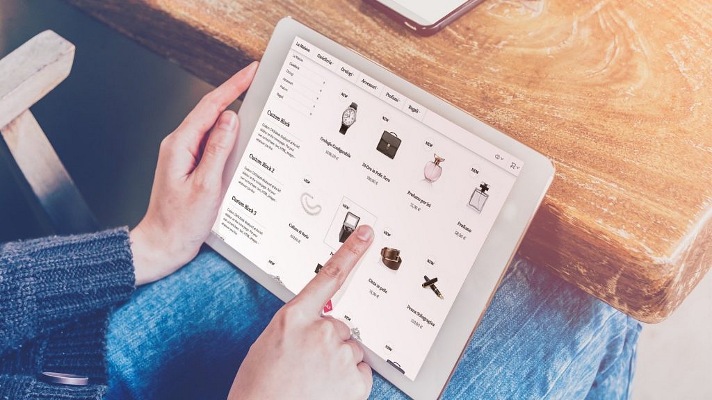
The introduction of the ” Discover More” button, very often in combination with Lazy Load, i.e., the progressive loading of content without the need to refresh the page, has marked a real breakthrough in the User Experience of the user who is searching for the product to purchase. Websites that use the “Discover More” button turn out to have a more intuitive and easy approach that does not require too many actions other than a single interaction, that of agreeing to see more results. One of the advantages of the “Discover More” button is that the list of products grows instead of replacing the results, and it allows the user to more easily compare products across an entire list. This is a popular solution used by those who pair their site with an e-commerce SEO strategy to achieve better SERP rankings without “slowing down too much” the current visitor’s frantic shopping.
Mobile buttons, limitations and advantages of small space
PAGEING (mobile)
When viewing products on mobile devices, pagination numbers can be difficult to cap accurately because they are often placed very close together. In addition, users browsing ecommerce from mobile are not always willing to wait for a new page to load.
INFINITE SCROLL (mobile)
Infinite Scroll for product lists, makes the footer inaccessible as new results are loaded continuously, pushing down everything else on the page.
DISCOVER MORE (mobile)
The “Learn More” button, offers many of the advantages over the other two methods, while also keeping the footer accessible at all times. Therefore, the best solution remains to place a large “Learn More” button at the end of the product list. However, from mobile some constraints remain even with this choice:
- Given that the mobile screen is very small, the product list takes up a large part of the screen, already with only two or three items. If about 50 products are displayed on each page and the products in the catalog are numerous, the user will have to interact much more than what is required of him on desktop.
- Users show less control over the scrolling product list; some may scroll too slowly, so much so that they have to continuously drag their finger across the screen. Others might scroll the list too fast because they are perhaps using momentum, scrolling products quickly, and in this case they might miss many products.
From mobile, it is therefore recommended to load a minimum of 15 to a maximum of 30 products before showing the “Learn More” button.
The loading method greatly changes the display of products
There is no universal template for the correct display of products. You should always consider so many aspects of the site itself, such as the industry and product type before choosing the most suitable method. For online shops that sell, for example, electronic products, it is recommended to keep the threshold of products published on the displayed page low.
If, on the other hand, you are dealing with products such as clothing, furniture or home decor, and gift items, the threshold can rise, as the list contains products that visually attract more.