Today is a special day. On the occasion of 129 years since his birth, Google decides to dedicate the doodle to Hermann Rorschach, a Swiss psychiatrist made famous by projective psychological testing through polychrome or monochrome inkblots.
The test involved an initial viewing of the patient and later interpretation. The therapist used his observations to understand his psychological profile.
The search engine then makes its logo interactive, offering a black-and-white image and making it animated. Two hands hold a sheet of paper, on which the spots take shape and next to it an arrow that scrolls through the variations of the design.
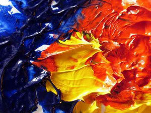
I took a cue from the doodle of the day to propose a reflection on color. Color has always been the subject of in-depth studies in all its facets by the most varied disciplines, trying to trace its smallest meanings and transmuting them into messages.
Colors convey to us psychological and emotional effects that should not be underestimated at all, so I want to focus mainly on this aspect.
We web designers hold the graphic aspect of a site, thus what directly reaches the visitor’s eyes. Choosing an ugly font rather than a dull color could ruin the work of entire days.
Since they directly affect visitors, it is necessary to pay the utmost attention to the colors used when designing a site.
Different colors have a different effect on readers, it is a fact.
The psychology of colors
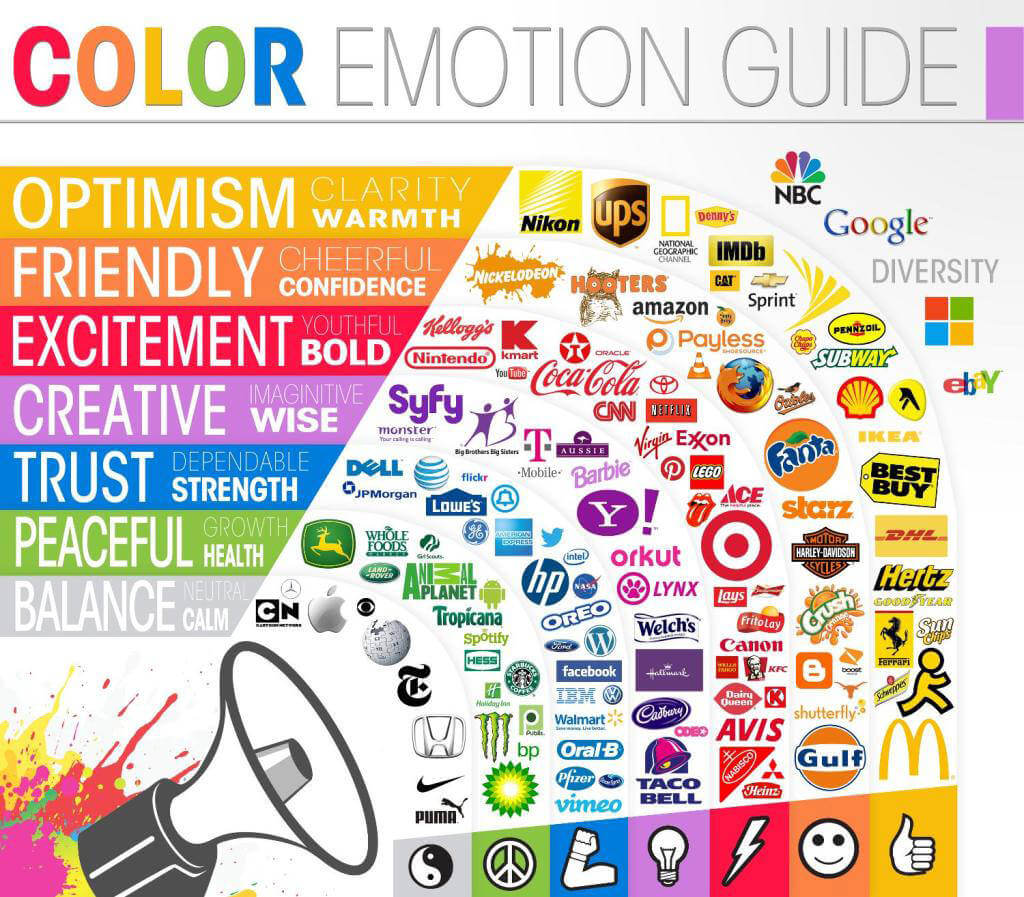
A good web page designer, therefore, must keep in mind not only the personal palette of colors but also the effects conveyed; each point of view changes depending on one’s experience, cultural context and above all by what emotions we associate with it. It is established, in fact, that emotions are closely related to the sale of the product so it is possible to direct the ‘attention and willingness to buy through the use of visual elements. In general there are the two macro categories that we can identify in:
- warm colors (yellow,orange, red), stimulating and positive, but also impetuous;
- soft colors (the pastel shades) reassuring and hopeful;
- cool colors (green, light blue and blue) decisive and detached.
Developing a good website means knowing how to strip away your own ways of seeing and empathize with those of the client. If you choose a color you like but not the customer … it’s a disaster. No matter finding matches or following your own color taste, if we know the specific effects of each color and follow the pattern we could not go wrong. In this regard, I would like to give some valuable pointers so that you can assume your client’s feelings and hit the mark.
Red: passion and attention.
It is a passionate color, which has always been an expression of love. From a psychological point of view it indicates warmth and food (note the McDonalds brand) because of its stimulating and at the same time aggressive character. Sometimes because of its intensity it symbolizes blood, fire, and violence. It is no coincidence that in distant ages it was identified with the red demon Lucifer. Tip: suitable for a site that wants to be dynamic, youthful, strong but above all it is used for particular icons so that they can attract the maximum attention of the viewer. If in front of a screen of various colors we have red icons, it is scientifically proven that the eye will fall right there. If you want to highlight something, you’re on the safe side with red. For example, Coca Cola, Lego, Nintendo and Canon; all multi-recognized brands.
Yellow: cheerfulness and danger.
As we all know, it is the color of the Sun and symbolizes happiness, wealth and cheerfulness. But, like everything, it also has the other side of the coin representing, some times, jealousy, betrayal, falsehood, danger, sickness and dishonesty. In fact, it is said that if you give a yellow rose you want to unconsciously express a feeling of jealousy. Tip: If you require energetic, clear graphics that hide a sense of growth and optimism, yellow is the right color, promoting communication and activating memory.
Orange: socialization and confidence.
It represents romance. Just think how the beautiful shades of sunset, can only evoke a feeling of welcome, hospitality and relaxation. Perceived as a vibrant color much in demand for websites because it symbolizes concentration. Tip: It expresses confidence and friendship so if the site is to be given an energetic impression, stimulating activity, orange is the most suitable color. It is especially suitable for youth sites that deal with lighthearted and topical subjects, promoting socialization.
Green: stability and relaxation.
It is the most beloved color because it inspires a feeling of tranquility, peace and relaxation, associated with nature, the environment,life, fertility and a desire to discover. The effect of stability produced by green represents, from a psychological point of view, the steadfast values that do not change. Advice: suitable for sites that want to express a regenerative and stable feeling. The design should be balanced among the various shades of green coloring and not concentrated on a single facet, thus attracting more attention. For example, most sites of an aesthetic nature choose precisely green as the mother color, offering a sense of recovery and self-control.
Blue: confidence and determination.
It symbolizes water, heaven, harmony, trust and loyalty. If you concentrate on looking at it for a long time, you will find that it evokes stillness, contentment and harmony. Just think of the beautiful seascapes. Tip: Dark blue is perfect for corporate and business site design because it is associated with determination and truth. Light blue, on the other hand, is mostly used for social websites that represent colloquiality.
Purple: creativity and imagination.
It symbolizes spirituality, creativity and imagination. It has always been the color that represents fairy tales, legends and great heroes because it has in it the feeling of suggestibility and tradition. Often identified with cruelty and weeping but also with penitence. Tip: Especially suitable for women’s sites dealing with magic, spirit or creations and for logos that want to express strength and power, stimulating creativity.
White: balance and firmness.
Our knowledge leads us to imagine white as a non-color symbolizing purity, cleanliness, innocence, chastity and peace. We need only think of the great deities of the past dressed only in a white veil to highlight their ethereal character. Tip: If you are asked for a graphic that represents security and balance … choose white, it promotes order and clarity. Such as the Mac logo, white as vigor and firmness.
Black: mystery and certainty.
It is the most mysterious and rich in culture. In some tribes it indicates the devil and brute forces; in Western culture it is associated with death, wickedness, unhappiness, anger, sadness and unhappiness, for example, it is said that when one is not at peace with oneself one is unconsciously inclined to put on black clothes as an outward expression of one’s soul. It is not only color that expresses negativity but also power, magic and elegance, especially in women’s clothing. Tip: It is used a lot for sites whose owners do not want to dare but rely on the elegance of total black that never goes out of fashion and a strong character.
Having given you an overview of the dictates necessary to be able to do web design at a high level, it only remains for me to wish you well and to give maximum vent to your “colorfulness.”